Are you struggling to create a cohesive color scheme at home? You may be wondering, “What is the 60-30-10 decorating rule?” Learn how to distribute colors in a way that achieves visual balance and harmony. In this post, I’ll show you how you might seamlessly incorporate this design secret into your space, effortlessly achieving clarity and style.
Key Takeaways
- The 60-30-10 rule is a guideline for creating balanced and harmonious interior designs by distributing colors in proportions of 60% dominant, 30% secondary, and 10% accent.
- Adapting the 60-30-10 rule in different living spaces helps in maintaining aesthetic consistency, with the dominant color applied to walls and large items, secondary color to textiles and accent furniture, and accent color to decorative items and artwork.
- The 60-30-10 rule can be personalized and adapted to suit individual styles and preferences, including playing with patterns and textures, and alternatives such as the 70-20-10 rule may be employed for a harmonious but customized color balance.
How the 60-30-10 Rule is Used?
The 60-30-10 rule is a classic principle in residential and commercial design, which is a foundational guideline for achieving balanced and aesthetically pleasing interiors. Here’s how this rule is applied across different types of design:
Residential Design

In residential settings, the 60-30-10 rule helps create a harmonious, welcoming, and stylish environment. For example, consider a living room where 60% is the dominant color used on walls or large furniture pieces like a sectional sofa. The secondary color, making up 30%, could be seen in curtains, area rugs, or a contrasting accent wall. The final 10% is for bold accents such as throw pillows, artwork, or decorative items, adding a pop of color that draws the eye.
Commercial Design

In commercial spaces, where functionality often takes precedence, this color rule ensures that design remains appealing without overwhelming the senses. The majority of colors (60%) might be neutral tones on the walls and large furnishings that blend with the corporate identity. The remaining 30% could be incorporated through flooring and mid-sized furniture, while the 10% accent colors can be utilized in branding elements, such as logos, signage, and smaller decor pieces that align with the company’s color scheme.
Consulting Your Interior Designer
To ensure that these elements are beautifully integrated into your home, consulting with your interior designer can provide you with professional guidance. An interior designer can help tailor these color proportions to your personal style and the unique characteristics of your space, enhancing the overall aesthetic and balance of your interiors.
Understanding the 60-30-10 Rule
Often, the secret to a professionally designed room lies in the artful distribution of color aimed at achieving visual balance. The 60-30-10 rule forms a solid foundation for this, whether you’re a seasoned interior designer, one of the many talented interior designers, or a DIY enthusiast in interior decorating. In fact, most interior designers rely on this rule to create visually appealing spaces.
To visualize this rule, imagine a room with white walls and a sofa accounting for 60% of the room, neutral flooring and side tables making up 30%, and accents in a single color contributing the remaining 10%. The presence of natural light in the room enhances the overall ambiance.
The 60% Dominant Color
The dominant color, as the term suggests, should be the most visible, covering the majority of the room. This includes walls and large furniture items such as sofas or wardrobes. Choosing a dominant color is the first step to creating a cohesive color scheme. Natural tones, such as sage green or olive, can make for a balanced and cohesive dominant color. The use of a cohesive color scheme ensures a unified appearance, enhancing the room’s overall harmony.
Your primary pattern should be applied extensively to key components like walls or substantial furnishings. This will create visual consistency and set the tone for the rest of the room. The dominant color forms the backdrop against which the secondary and accent colors will stand out.
The 30% Secondary Color
Next up is the secondary color, accounting for 30% of the color scheme. This color complements the dominant color, providing a contrasting backdrop that enhances the visual interest of the space. You can introduce this secondary color through elements such as curtains, area rugs, and accent chairs, which serve to complement the main color scheme.
Adding depth and interest to the secondary color can be achieved with complementary or contrasting patterns and textures in window treatments or smaller furniture pieces. This layer of contrast not only adds visual depth but also infuses the room with a unique personality.
The 10% Accent Color
Finally, we have the accent color, which accounts for 10% of the color scheme. This color adds a burst of personality and flair to the room’s design. Small decorative items and accessories are the perfect means of introducing this accent color.
Experiment with textures, patterns, and paint colors for your accent color. This can add a vibrant touch and visual interest. Cushions and artwork are fantastic vehicles for introducing vibrant hues like bubblegum pink or bright turquoise.
The accent color, though only making up 10%, can significantly influence the room’s mood and ambiance.

Implementing the 60-30-10 Rule in Different Rooms
Now that we understand the 60-30-10 rule and its components, let’s delve into how to apply it in different living spaces. Your living room, being a highly social space, is an excellent starting point for implementing this rule. Here’s how you can apply the rule in your living room:
- The dominant color can be applied to your walls and major furniture pieces like sofas.
- The secondary color could include textiles like linens, curtains, and rugs.
- The accent color might feature through smaller decorative items or artwork.
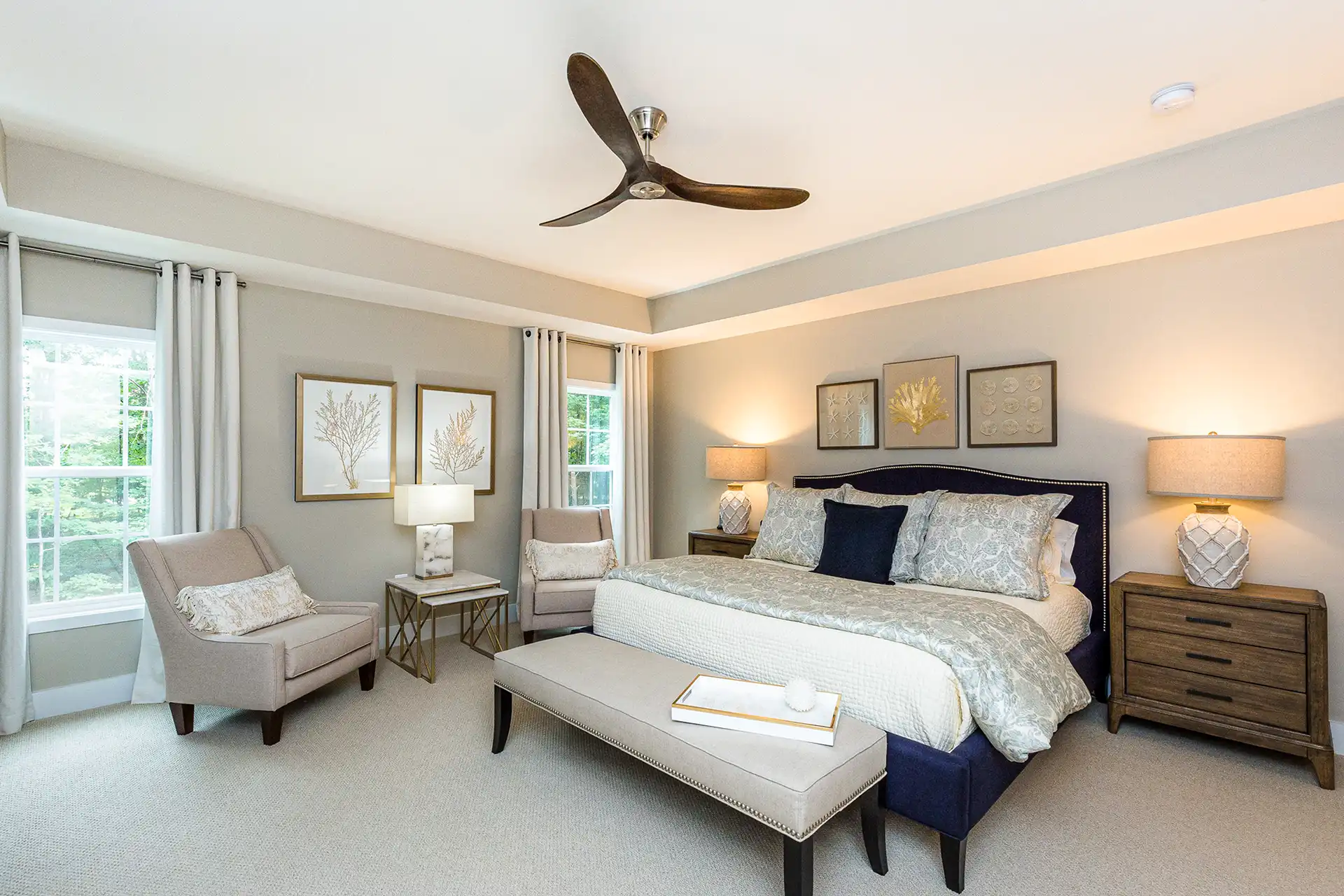
Consulting your interior designer can help you to add balance and ensure that each color proportionately enhances the aesthetics and function of your room. Bedrooms, on the other hand, present a different canvas. Here, the dominant color can be applied on walls or large furniture like beds and wardrobes. The secondary color can be incorporated through bedding, chairs, and curtains. Lastly, the accent color can make its appearance through artworks, pillows, and accessories.
Wall art serves as a versatile medium to introduce the accent color in living rooms, providing leeway in selecting expressive hues for an impactful statement. Your interior designer can guide you in making these choices, ensuring that the colors harmonize well within your space.
Choosing Colors for Your 60-30-10 Palette
Selecting colors for your 60-30-10 palette can be an exciting process, allowing you to play with different hues and combinations. Whether you’re a fan of bold hues like yellow and teal or prefer classic shades like beige and ivory, there’s room for all preferences within the 60-30-10 rule. You could even opt for a neutral monochromatic scheme or daring combinations like shades of grey, black, and a touch of gold. The possibilities are endless and can be tailored to reflect your personal style.
Using the Color Wheel
The color wheel, a fundamental tool in design, can be your best friend when it comes to choosing colors for your 60-30-10 palette. It can guide you toward complementary colors, analogous, or monochromatic color schemes, all of which can ensure a harmonious balance.
A monochromatic color scheme, for example, might utilize shades of the same color, such as white, grey, and black, as the dominant, secondary, and accent colors, respectively. If you’re aiming for a bit more color diversity, then choosing a main color from the color wheel and complementing it with analogous or contrasting colors can help define a harmonious color scheme.
Finding Inspiration
While the color wheel is a great tool, don’t forget to tap into your creativity and find inspiration from other sources. Artwork or printed fabrics can provide a harmonious palette and fulfill the 10% accent component in the 60-30-10 decorating rule. A favorite piece of art or a cherished patterned fabric could be your starting point for a personalized color scheme.
Experimentation is key when it comes to choosing your palette. Consider trialing potential colors with wall art or painted sample swatches on walls. This allows you to visualize the balance of the 60-30-10 rule without a full commitment. Remember, your space is a reflection of you, so don’t be afraid to make it personal.
Adapting the 60-30-10 Rule for Unique Styles
Sometimes, creativity calls for rule-breaking, or at least rule-bending. The 60-30-10 rule is no exception. By adapting this rule, you can reflect your unique taste while embracing current interior design trends. For example, you might decide to incorporate multiple secondary shades within the 30% to capture character and authenticity. So long as balance is maintained, there’s room for personalization within the rule.
In 2024, chunky and fun accents like oversized vases and quirky decor pieces are trending. These can be excellent mediums for introducing your accent color. Alternatively, you might opt for a monochrome palette or a black and white contrast with a pop of color for the accent. The beauty of the 60-30-10 rule lies in its adaptability, allowing it to cater to various design styles.
Mixing Patterns and Textures with the 60-30-10 Rule
While color is crucial, the 60-30-10 rule doesn’t stop there. It can also be applied to patterns and textures within your space, adding an extra layer of depth and interest. Consider using the largest pattern for 60% of the room, complementary smaller patterns for 30%, and a distinctive texture for the final 10%.
Don’t shy away from contrasting textures. The juxtaposition of different materials, such as smooth silk next to rough wood, can enhance the sensory experience of an interior space. Similarly, mixing innovative materials, textures, and patterns along with utilizing visual elements like light and shadow can add depth and interest, creating a truly dynamic interior and effectively creating spaces that captivate the senses, both in indoor and outdoor spaces.
Alternative Color Proportions
Sometimes, the standard 60-30-10 rule may not produce your desired results, or perhaps a different scheme simply feels more harmonious for your space. In such cases, consider alternative formulas like the 70-20-10 rule or a 30-30-20-20 split. These variations allow for a different distribution of colors while maintaining the principle of balance inherent in the original rule.
Remember, though, that when customizing the proportions, it’s important to maintain a balanced and harmonious color scheme. Thoughtful selection of shades is key to achieving unity in your space, even as you alter the standard percentages.
Summary
In essence, the 60-30-10 rule offers a solid foundation for creating balanced, harmonious interiors. It’s a principle that can be adapted to reflect personal styles, applied to different rooms, and even extended to patterns and textures. The rule also allows for creativity and experimentation, from choosing colors using the color wheel to finding inspiration in artwork or current trends.
Frequently Asked Questions
What is the 60-30-10 rule in interior design?
The 60-30-10 rule in interior design involves allocating 60% of the room to the dominant color, 30% to the secondary color, and 10% to the accent color, to achieve a balanced, harmonious look.
How can I apply the 60-30-10 rule in different rooms?
You can apply the 60-30-10 rule differently in various rooms. For example, in a living room, use the dominant color on the walls and major furniture pieces, the secondary color in textiles like linens, curtains, and rugs, and the accent color in smaller decorative items or artwork.
How can I choose colors for my 60-30-10 palette?
To choose colors for your 60-30-10 palette, use the color wheel to find complementary, analogous, or monochromatic color schemes. Alternatively, seek inspiration from artwork, printed fabrics, or current trends.
Can I adapt the 60-30-10 rule to reflect my personal style?
Yes, the 60-30-10 rule can be adjusted to reflect your personal style by using alternative formulas or incorporating multiple shades within the secondary color proportion. Experiment with different options to find what works best for you.
Can I use the 60-30-10 rule for patterns and textures?
Yes, you can use the 60-30-10 rule for patterns and textures in your room design to create a balanced and visually appealing space.